
Showing posts with label Charlene Moore. Show all posts
Showing posts with label Charlene Moore. Show all posts
Friday, 27 January 2012
FINISHED!
This is the last post on the blog! I have learnt a lot about the conventions of a promotional package and the theories behind them. I have enjoyed putting them into practice with the rest of he team, and hopefully you like what we have created :)


Thursday, 26 January 2012
EVALUATION - Question 4
What have you learned from your audience feedback?


We also got some feedback from our fellow students at Candi! Here are some of the comments..


These are some videos from my teacher and two students about my ancillary work, and music video.
This video explains what I have learnt from the feedback.
Wednesday, 18 January 2012
EVALUATION - Three
How did you use media technologies in the construction and research, planning and evaluation stages?


RESEARCH AND PLANNING:
INTERNET. Youtube, Google and Hotmail. Without the use of the internet for research purposes, the media products we have created would not be as successful. By looking up past music videos and ancillary print work on youtube, it is able to establish the conventions of different media products.
Google is the search engine for all of our research. Many images found on this blog are a result of a google images search, which makes it easy to find new information and helpful websites.
BLOGGER.
Blogger is the online blog (short for ‘web log’) that this coursework is posted on. The online format has allowed us to post images and embed videos from other websites.
PREZI.
The online presentation device that is what we used to present our pitch to the class and our teacher. The prezi enabled us to add images as well as text.
This video illustrates how we have used different websites on the internet for research and planning purposes.
CONSTRUCTION:
Brand new state of the art VIDEO CAMERAS.
The cameras are used to film our music video, and also some extra blogs that we have put on. The high quality of the cameras meant that we were able to produce a high standard of coursework. On the cameras we are able to view what we have filmed and judge whether the shots were good or need improving.
PHONES, FLIP CAMERAS, SCREEN RECORDING (I Show You), SCREEN VIDEO and Digital Cameras
These are the three mediums we used to film our blogs explaining our research, planning and construction. Phones and Flip cameras are small and easy to carry around which makes them convenient when we are out on location. These were used to film small videos for the blog to explain what we have done during each stage of the coursework process. The screen recording made it easy to film blogs when we were in college, working on our coursework.
MAC
The state of the art computers that allow us to put together all of the technologies, and make them work together. They hold the software including Final Cut pro, Photoshop and Quicktime amongst many other packages. This is where we constructed the music video and the ancillary work, with the different softwares. As it has so many different packages it was easy to combine all of the work in one space. It works in conjunction with the

Editing in FINAL CUT PRO:
Final cut pro is the software in which we edited our music video. We also edited some extra clips that were not successful with captions, to put on the blog. With
Edits: brightness and contrast To improve the overall look of the music video, we edited the brightness and contrast so that the video has a more striking and ‘polished’ look.
By making some clips slow motion, there is a dramatic, stylised feel to the video. Also, using the software I was able to reverse a few clips
Layering clips
ANCILLARY
We used a digital camera to take the photographs of Sifan for the print work. The quality of the photographs because of this, was high, which made it easy to edit.
 |
| Image of an unedited photograph in photoshop |
PHOTOSHOP. Is one of my favourite editing software’s as it is easy to play around with and experiment with different edits. I wanted a three panel Digipak to include lots of photographs of the artist. All of the photographs are edited to black and white, for a crisp and neutral look, so it does not look to ‘busy’ with too much colour. To make the images more defined, the contrast tool on Photoshop makes images look darker and crisp. By not over editing the images, it is still clear what the artist looks like.
By using layers on Photoshop, It was easy to layer photographs and text, to make a realistic Digipak and Advertisement.
Tuesday, 17 January 2012
EVALUATION Part Two
How effective is the combination of your main product (video) and ancillary texts (Digipak and Advertisement)?
It is important for the music video to match the ancillary work as they are both part of a particular house style. They have to work in congregation with each other as they should have clear visual and concept links.


In the planning for the music video, we made sure Sifan wore clothes similar to examples style. We had two costume changes during the video, but the over all style consisted of jeans, trainers and a shirt. In the Ancillary, Sifan wears similar black jeans with the baseball jacket he wore in the video, which is similar to the smart yet casual style that we created for the artist. It is important for the artist to have the same style across all pieces of work as we have created a grime persona for him that he will be judged on by people who have not yet heard his music, meaning his clothing also has to reflect the genre.
In the music video, we edited the clips brightness and contrast to make the images look more crisp and more professional. Whilst editing in Photoshop, I used the contrast tool after editing my images into black and white. This created a similar striking look, but the images are darker, as they have to work as a foundation for other texts and colours being placed on top of the images.
 |
| Music Video |
 |
| CD Housing |


An important feature of both the music video and print work is the use of close ups. In the music video we have various base tracks of different backgrounds which include close ups of the artist. This is the same with the ancillary work. The front cover has a close up of the artist, which is a convention for grime/rap albums as I have discovered in my research. The image features Sifan looking happy, which promotes the artist in a positive light. I originally wanted the photograph of the mid shot of sifan looking down but my teacher said that it is important for the artists face to be visible, particularly on a debut album. I therefore chose a close up image, as it communicates the artists features across to the audience, making the artist memorable.
The over all character representation is illustrated through both the music video and ancillary. Both the CD cover and Music video shows the element of energy. In the music video, there are two scenes that feature people running. The first is outside in a park, when they run past the artist and the second is when some teenagers run away from a house party the morning after. This links with the image of the inside panel of Sifan jumping, and is captured mid air, which was inspired by the music video by Example, Stay Awake.

The title of the song, 'See the Sea' is a play on words, which inspired both the name of the artist (C Moore) and the title of the album cover (Word Play). The artist name is a play on words meaning 'see more,' which encourages the consumer to see beyond the surface meaning of the song and name and read into them, revealing that they are both plays on words. This links with my album name word place, which reinforces this idea.
The many different images in my Digipak reflect the large amount of base tracks we used in the music video. We experimented with different angles


My ancillary work shows visual links in the colour scene, typography and images used. For the advertisement, I used an image, taken straight out of the digipak, to keep the theme ongoing.The use of the album cover in the advert lets consumers know what they will be looking for, as it shows a direct link between both pieces of work.
EVALUATION - One
In what ways does your media product use, develop or challenge forms and conventions of real media products?
Towards the beginning of the coursework, we researched two theorists: Andrew Goodwin and Carol Vernallis, who both put forward ideas about the conventions of a music video.
ANDREW GOODWIN:
The idea of women used as a sexual object to be looked at by the male spectator, is something that is explored by Goodwin, and is said to be articular in heavy metal and hip hop genres. As our genre is grime, an offspring of hip hop, we have decided to use this idea in the video in the form of our motif. By covering up her face, and only revealing her body, she is seen as a faceless object by the viewer. In the screenshot from the music video below, it is obvious that we have applied Goodwins theory to other parts of the video by hinting at a party scene, featuring young people showing skin, for the male view.


Towards the beginning of the coursework, we researched two theorists: Andrew Goodwin and Carol Vernallis, who both put forward ideas about the conventions of a music video.
ANDREW GOODWIN:
We have stuck to some conventions of a pop music video, according to Andrew Goodwin to create a realistic music video. Goodwin states that pop videos rely on repetition, which we have posed with the use of multiple base tracks with similar backgrounds. The locations are revisited, which illustrates the repetition of location often seen across most music genres. Also, our motif has been repeated throughout the video in different scenes, including the park, the house party and in Dalston East Curve Gardens. This use of the motif, I have extended even further into the ancillary work as I have used the image of the motif as the background for the CD housing, which pushes the use of repetition into something that the audience can continually look for.
The idea of women used as a sexual object to be looked at by the male spectator, is something that is explored by Goodwin, and is said to be articular in heavy metal and hip hop genres. As our genre is grime, an offspring of hip hop, we have decided to use this idea in the video in the form of our motif. By covering up her face, and only revealing her body, she is seen as a faceless object by the viewer. In the screenshot from the music video below, it is obvious that we have applied Goodwins theory to other parts of the video by hinting at a party scene, featuring young people showing skin, for the male view.


CAROL VERNALLIS
Carol Vernallis describes music videos as a separate genre to film and television. The music video is a genre that explores different aspects of the musicians lifestyle from class to gender. In our video, we have tried to reflect conventions of the grime genre so we used locations with urban backgrounds, such as the Dalston mural, which features street art, giving the music video a modern'street' vibe. This ties in with the graffiti background found in another base track, which connotes the unfortunate financial state of most grime artists in the music industry.
 |
| Graffiti Wall |
 |
| Dalston Mural |
 |
| Tour dates on advert |

My house style correlates with my CD cover, black, white, red and blue. Album covers have a limited amount of covers, to avoid looking to 'busy'. I have stuck to neutral and primary colours to keep the advert simple, as it is supposed to be aesthetically pleasing and not take away from the purpose of the advertisement - to promote the album. I have used the same typography in both pieces of ancillary work to continue the house style. My choice of font is sans serif, which connotes an informal genre of music. The way that it looks written


CD



I have included some conventional details on the album cover to make it look realistic. The parental advisory sticker on the bottom of the album is common in rap and grime genres due to the explicit content of the lyrics. The name of the artist on the spine is also a feature across all digipak's and CD covers as it makes it easy for the consumer to find the CD, the code at the top is a conventional feature that I added for realism.
 |
| Tracklist |
Tracklists are a conventional feature for CD and Digipak back covers as this is how the audience can tell what songs are on the particular CD in the shop before they buy it. I have included songs from Example's real album 'Won't Go Quietly' Including one of my own 'Word Play' as it is common for albums to be named after a song, for continuity. In rap albums, it is also common to make the Producer more noticeable then with other genre's. This is because important producers can affect the success of the album, particularly if they are also an artist, which is why I have chosen the artist, Labrinth.


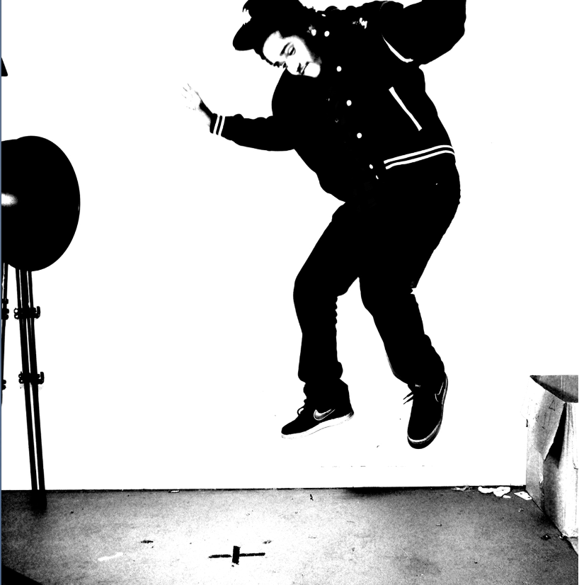
My Digipak features many images of the artist. There is only one panel out of six that has an image of something other than the artist. This is important as my artist is up and coming, so is unknown to most of the public. It is important for the consumer to make a connection with the artists identity, so he will be easily recogniseable in the future.


Thursday, 12 January 2012

Below are four recent grime albums.


The four albums all feature an image of the artist. This is important, especially for up coming artists at it reminds the audience of the artists image and looks. I like the close up of Professor Green and Tinchy Strider.
Both Devlin and Tinie Tempahs album covers seem to have more of a concept. Devlins street with brick background hints towards his working class background, which is also evident in the title of the album 'Blood, Sweat and Beers' which connotes the artists struggle for success. Tinie Tempah on the other hand, has an album that features him cradling New York City, which implies his rise to stardom in the states after two hit singles in the album. The title of the album is 'Disc-over' which implies the newly discovered success and fame that Tinie Tempah has received. The play on words with he dash hints towards the music side of the CD, proving that he is a serious artist.
Shortlist of font, colour and layout.
Tracklist

My chosen typography was a sans seris font 'Chalkduster' I used this font because it is informal and easy to read. I entitled my album 'Word Play' which hints at the arist's lyrical skill and ability to write songs. The typography itself looks like a piece of chalk that has been written on a blackboard, as it is in a basic, handwriting style and bits of chalk come away from the letrters.
I am predominantly using black, white, red and blue for both my digipack and advert. This is because I want to keep both outcomes simple, by only using nuetral and primary colours. Black and white is a good basis that any colour goes well with. so I am going to edit the photographs in black and white so that they will be a foundation for the colour that I will add on with the typography. I chose red and blue bbecause they are masculine colours that contrast, adding colour and third dimention to the photograph.
Tuesday, 10 January 2012


Thursday, 5 January 2012


Subscribe to:
Posts (Atom)