In what ways does your media product use, develop or challenge forms and conventions of real media products?
Towards the beginning of the coursework, we researched two theorists: Andrew Goodwin and Carol Vernallis, who both put forward ideas about the conventions of a music video.
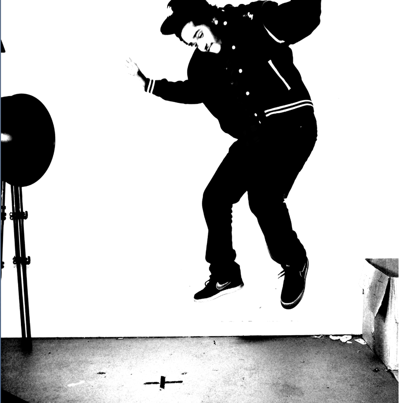
ANDREW GOODWIN:
The idea of women used as a sexual object to be looked at by the male spectator, is something that is explored by Goodwin, and is said to be articular in heavy metal and hip hop genres. As our genre is grime, an offspring of hip hop, we have decided to use this idea in the video in the form of our motif. By covering up her face, and only revealing her body, she is seen as a faceless object by the viewer. In the screenshot from the music video below, it is obvious that we have applied Goodwins theory to other parts of the video by hinting at a party scene, featuring young people showing skin, for the male view.


Towards the beginning of the coursework, we researched two theorists: Andrew Goodwin and Carol Vernallis, who both put forward ideas about the conventions of a music video.
ANDREW GOODWIN:
We have stuck to some conventions of a pop music video, according to Andrew Goodwin to create a realistic music video. Goodwin states that pop videos rely on repetition, which we have posed with the use of multiple base tracks with similar backgrounds. The locations are revisited, which illustrates the repetition of location often seen across most music genres. Also, our motif has been repeated throughout the video in different scenes, including the park, the house party and in Dalston East Curve Gardens. This use of the motif, I have extended even further into the ancillary work as I have used the image of the motif as the background for the CD housing, which pushes the use of repetition into something that the audience can continually look for.
The idea of women used as a sexual object to be looked at by the male spectator, is something that is explored by Goodwin, and is said to be articular in heavy metal and hip hop genres. As our genre is grime, an offspring of hip hop, we have decided to use this idea in the video in the form of our motif. By covering up her face, and only revealing her body, she is seen as a faceless object by the viewer. In the screenshot from the music video below, it is obvious that we have applied Goodwins theory to other parts of the video by hinting at a party scene, featuring young people showing skin, for the male view.


CAROL VERNALLIS
Carol Vernallis describes music videos as a separate genre to film and television. The music video is a genre that explores different aspects of the musicians lifestyle from class to gender. In our video, we have tried to reflect conventions of the grime genre so we used locations with urban backgrounds, such as the Dalston mural, which features street art, giving the music video a modern'street' vibe. This ties in with the graffiti background found in another base track, which connotes the unfortunate financial state of most grime artists in the music industry.
 |
| Graffiti Wall |
 |
| Dalston Mural |
 |
| Tour dates on advert |

My house style correlates with my CD cover, black, white, red and blue. Album covers have a limited amount of covers, to avoid looking to 'busy'. I have stuck to neutral and primary colours to keep the advert simple, as it is supposed to be aesthetically pleasing and not take away from the purpose of the advertisement - to promote the album. I have used the same typography in both pieces of ancillary work to continue the house style. My choice of font is sans serif, which connotes an informal genre of music. The way that it looks written


CD


I have included some conventional details on the album cover to make it look realistic. The parental advisory sticker on the bottom of the album is common in rap and grime genres due to the explicit content of the lyrics. The name of the artist on the spine is also a feature across all digipak's and CD covers as it makes it easy for the consumer to find the CD, the code at the top is a conventional feature that I added for realism.
 |
| Tracklist |
Tracklists are a conventional feature for CD and Digipak back covers as this is how the audience can tell what songs are on the particular CD in the shop before they buy it. I have included songs from Example's real album 'Won't Go Quietly' Including one of my own 'Word Play' as it is common for albums to be named after a song, for continuity. In rap albums, it is also common to make the Producer more noticeable then with other genre's. This is because important producers can affect the success of the album, particularly if they are also an artist, which is why I have chosen the artist, Labrinth.


My Digipak features many images of the artist. There is only one panel out of six that has an image of something other than the artist. This is important as my artist is up and coming, so is unknown to most of the public. It is important for the consumer to make a connection with the artists identity, so he will be easily recogniseable in the future.


No comments:
Post a Comment