As it's nearly Christmas, it got me thinking that industries such as the music one take advantage of different holidays and celebrations in selling and promotion. This is therefore something I too should think about when promoting my Digipak. Say the advertisement came out during the summer, it could perhaps promote the tour as it could be an open one amongst the nice weather etc. or perhaps if it was coming out during winter, it could have a wintery touch to it, of course the colour scheme will be similar to the one on the digipak, however a little element such as a Santa hat or snow flakes could be added to portray the season, and therefore ease the audience and put them in the so called ‘buying mood’.
Friday, 23 December 2011
Thursday, 15 December 2011
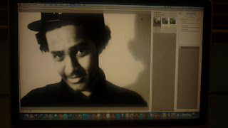
Today i started to add effects to the photos i am using , its hard to come up with the right one here are some examples i looked at.
Tuesday, 13 December 2011
Editing - effects
I was trying out different effects and working with the brightness/contrast of the images that I will be using on my digipak. I did this on PhotoScape and if I liked something I saved it so that I could use the image in college on Photoshop.
Editing process - getting the effects right
For the front panel of my digipak I wanted to use an effect that had the main image in the middle and two images less obvious with different colours (red and green) behind it, but the images were all the same one just edited differently. The reason I planned on doing this was to create this whole idea of false reality, false images etc. and so it relates to the album name. Also having effects like these is a characteristics of my genre. It took a while to actually find the right effect and get it perfect, but in the end it turned out as I visualized it.
This was a new effect I learnt about today which allows me to adjust the opacity of an images. It came in handy!
All the images above show the different effects and ways I experimented with to get the final look.
Here's what the final images looks like, although having consulted with fellow media students I was advised to changed the lighting of the very first image. Also I'm still not sure of the positioning of the name, in my pitch I had the name next to his hand, however when I tried it out, but it didn't look good so I had to change it.
Editing - Getting the right font
The first thing that I wanted to do was play around with the fonts. In the end as you can see from the pictures bellow although the style of writing was good and I was happy with it, the colours were to plane and blended in too much with one another. This meant that I now have to go and re think which text colour will best suit to be on the front and back of my digipak.
Photo shoot and final chosen photos
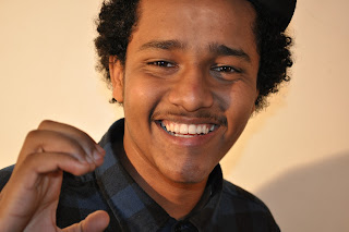
By the end of our photo shoot we had about 60 pictures which we were really happy about because it meant we had a lot of images to choose from and work with. In the end I narrowed my choice down to about 10. I tried to choose at least 2 close ups, 2 mid shots, 2 long shots and ones that portray his personality. After that I narrowed them down again to my final 3 images.
I chose the image above because its a long shot of the artist allowing the audience to get a full idea of him, which is good as he is a new up and coming artist so he needs to became as familiar as possible.
I'm still not 100% sure which of the two images I will use for the inside panels. However my chose came down to these two because they both portray his personality and are fun and attention grabbing.
Pitch for ancillary products
Once my designs were complete for the digipak and advertisement, I had to pitch my ideas to one of the teachers. I explained all my ideas and my reasons for choosing everything on there. In the end she was happy with my ideas and said it was alright for me to start actually working on my ancillary products now. Woo :D
My Pitch
My 5 words to describe my digi pack and advertisement are bold, boisterous, colourful, dance and happy.
I will be using 4 panels for my digi pack. My magazine advert will be located mainly in clubs as it is a dance album so clubbers are more likely to buy it. It will also be located at bustops , cd shops. local shopping outlets and the internet .
I got my ideas for examples album as i copied his tracks on my own track list.
I then got the thumbs out to go ahead and start making the real thing.
This is my advert for my digi pack , it includes of a photo of my album cover , my artist name and the album, when the album is realised , where it is available and the record company name and also social networking sites where it will be advertised.
Subscribe to:
Comments (Atom)


