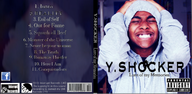
 When it came to creating my digipak the idea of focusing the whole thing around my artist and portraying his personality through as much as i could was inspire by the example digipak of previous existing ancillary products. I saw that this digipak worked really well because of the fact that the artist's personalty was clearly represented.
I also had some inspiration from previous existing advertisements such as the example I have given. They both use dark tones and it make them work because it relates to their genre. Also one of the examples I have provided here has the out now date right in the middle which i found really effective as I noticed it straight away so I thought I might use the placement for my own advertisement too. The idea of having hand held sign came from Example's album Wont go quietly. I thought it worked well there to create a chilled out fun atmosphere something my artist wants to be associated with too.


The idea to have three images instead of one of my artist came from Tinie Tempah's single Wonderman where its him and other people in the background, now I thought this idea was good but I wanted to have just my artist so I thought of blurring the other two images of him that will appear behind the main one on the front cover. By having three images of my artist it connotes that you see more of him and his music which also relates to his name C. Moore.

No comments:
Post a Comment